Articles as conversation starters, not endpoints

The opportunity
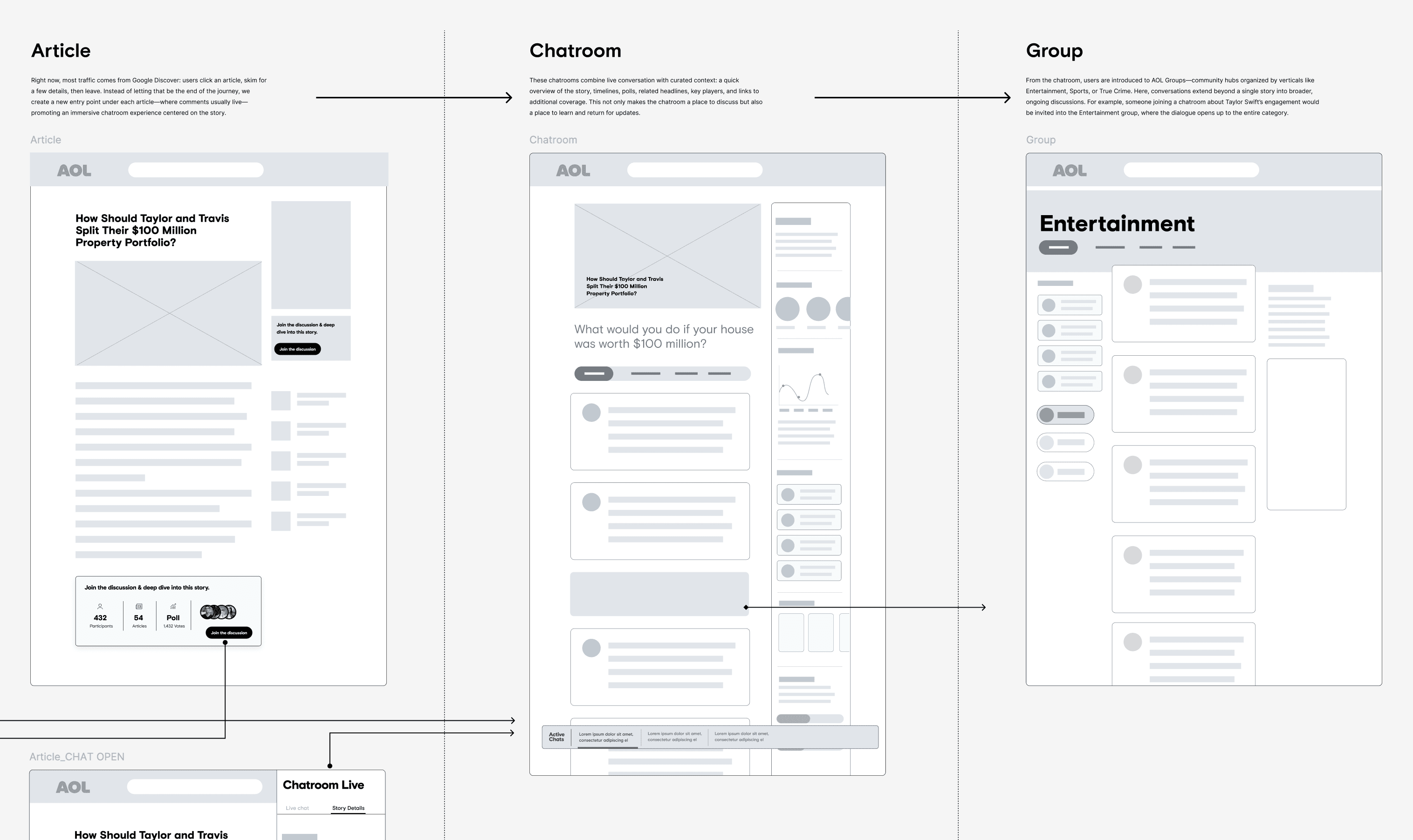
AOL.com is a content platform built around shared interests — but reading an article had always been a solo experience. You'd show up for the piece, read it, and leave. There was no way to connect around what you were reading, ask a question, or discover more based on what others in the community found interesting.
That was the opening. The opportunity was to bring people together around content in a way that felt natural — not tacked on.
The non-negotiables
We were building on top of a heavily monetized, legacy-era product, which meant the guardrails were real — and they were the first thing I had to design around, not the last.
- 01
The community experience couldn't cover ads.
- 02
It couldn't appear before ads loaded.
- 03
Underneath all of it, legacy code limited what we could build and how fast we could move.
Good design here wasn't about what was ideal. It was about finding the best possible experience inside a tight set of non-negotiables.
The move within the box
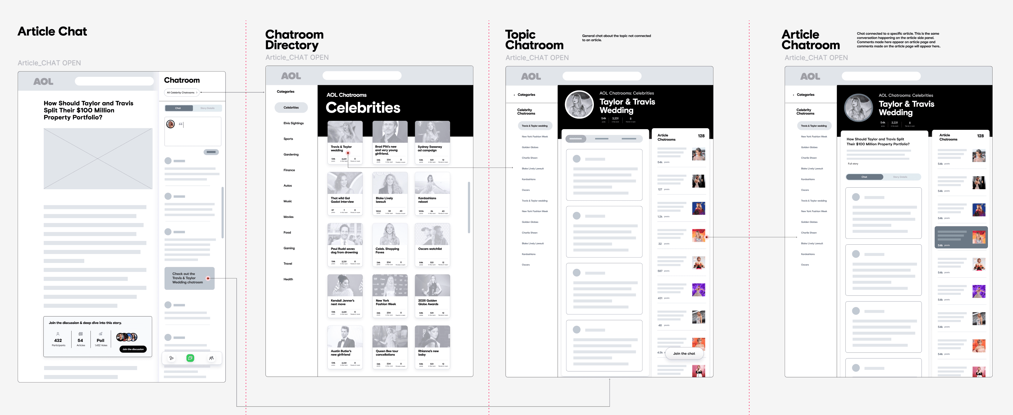
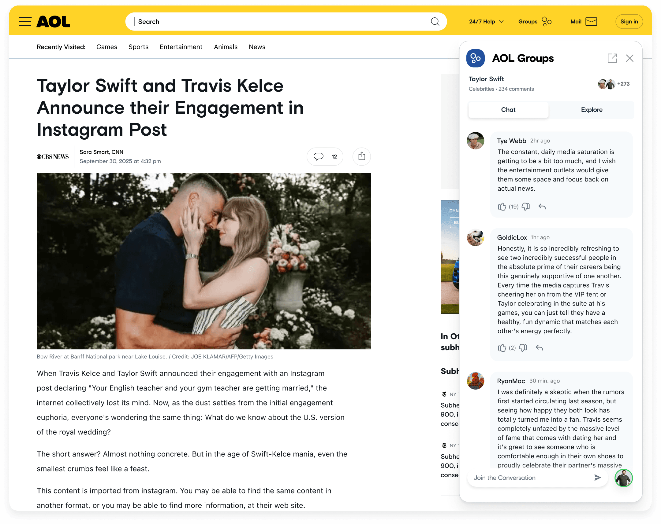
The solution was a side pane on the article page — a space for chat plus an explore feature, letting users engage with content and community without disrupting the core reading experience. The placement was intentional: additive, not intrusive. The article stays the article. The community lives beside it, for the people who want more than a passive scroll.
I led design for this initiative end to end, working with one PM, one scrum master, and a four-person engineering team split between front-end and back-end. I drove the UX direction and built full prototypes that became the backbone of our brainstorming and alignment sessions — getting ideas out of the abstract and into something the whole team could react to and make decisions around. And I worked closely with engineers through QA to close the gap between what was designed and what actually shipped.


What shipped
We shipped an MVP that honored the business constraints while still creating something genuinely useful — a real community surface on a page that had never had one.
The plan after launch was to run user interviews and gather qualitative feedback to shape the v1 priorities. Let real behavior and real voices drive what came next, instead of guessing.
The MVP launched. And then the entire team was laid off.
What it proved
We never got to do the follow-up research. But what we shipped was a functional, thoughtfully constrained community experience, built on top of one of the more challenging technical and business environments you can work in.
The work proved that meaningful UX improvement is possible even when the constraints are stacked — it just takes creative problem-solving, close collaboration with engineering, and a clear sense of what you're actually optimizing for.
“Her ability to grasp product direction, user behavior, and structural implications went far beyond surface-level design. She thinks about long-term product health.”