Designing a calmer path to buying a weighted blanket
Overview
kNus is a mobile-first storefront for a textile company specializing in weighted blankets. The category itself was the problem: most prospective buyers had never owned one, didn't know what weight to pick, and were nervous about spending $150–$250 on something they couldn't try first. Over four weeks I led research, brand, UX, and UI from scratch — partnering directly with the founder and engineer.
The result was a calm, editorial mobile experience built around a short personalization wizard that translated body weight, sensory preferences, and household setup into a single confident recommendation. Qualitative testing showed users left the flow feeling reassured rather than overwhelmed, and the wizard's plain-language "why this fits you" moment became the most-praised screen in usability sessions.
Outcome at a glance. In the second round of usability testing, the shortened wizard completed at a markedly higher rate than the longer, clinical first draft; the "why this fits you" recommendation drew the strongest unprompted reactions of any screen; and the founder's biggest pre-launch worry — a flood of sizing-support questions — never materialized at launch.

The Challenge
kNus was launching into a category most people couldn't yet describe. Weighted blankets have real, evidence-backed therapeutic value — research links them to better sleep, reduced anxiety, and sensory regulation for people with ADHD and ASD. But mainstream awareness in 2020 was thin, and the dominant purchase experience online was a wall of SKUs filtered by weight in pounds — a unit that means almost nothing to a first-time buyer.
The business problem was twofold:
- Category education. We had to explain the emotional benefit before asking anyone to convert.
- Decision support. Even buyers who understood the product struggled to choose a weight, a fabric, and a size — three independent variables, often involving a second person in the household.
The user pain wasn't price or brand trust. It was agency. People didn't know enough to pick well, and the category's clinical vocabulary (deep pressure stimulation, GSM, body-weight ratios) made them feel like they needed a prescription to buy a blanket.

User Research & Discovery
For a one-month project, I leaned on a small but layered mix.
- 5 target user interviews with people who had either bought a weighted blanket or seriously considered one. ~45-minute sessions focused on emotional context — what was happening in their lives when they searched for one.
- General survey distributed via the founder's network and adjacent wellness communities, used to triangulate language and pricing expectations.
- Two rounds of Maze testing on low- and mid-fidelity prototypes — roughly 20 participants total, mapped to the wizard, PDP, and checkout.
- Competitive and market analysis across direct competitors (Bearaby, Gravity, Calm Blanket) and adjacent wellness e-comm to study how emotional brands frame functional purchases.
Three insights reframed the entire direction.
1. Emotional language beat technical specs. Users didn't read pound counts or fabric GSM. They scanned for verbs and feelings. One participant said, "I just want to stop feeling restless at night." That sentence was worth more than any sizing chart.
2. Choice overload was the conversion killer. Five weight options created anxiety, not choice. "I feel like I need a prescription just to pick one," one tester said. The cognitive load of self-diagnosing was its own friction.
3. Trust was front-loaded on mobile. Without the ability to touch the product, users leaned heavily on UGC, reviews, and return-policy language before they ever scrolled to the buy button. Trust signals couldn't live below the fold.
Those three insights drove every subsequent call: wellness-forward positioning, a personalization wizard in place of a filterable grid, a trust-first PDP hierarchy, and elevated reviews and UGC.

Ideation & Wireframing
We explored three macro directions in FigJam with Simon and the engineer:
- Guided wizard — quiz-driven personalization, one recommendation at the end.
- Smart filter — traditional filterable catalog, enhanced with plain-language tooltips.
- Editorial discovery — long-form content driving people into a curated shop.
The wizard won because it was the only direction that addressed both the education gap and the decision-support gap in a single flow. The smart filter still required users to know what to filter on; editorial discovery educated well but punted on the choice itself.
The first wizard draft was longer and clinical — it included a multi-question sleep assessment (Do you wake up during the night? How often? At what time?) intended to feed a richer recommendation. Maze testing on that prototype produced one of the most useful quotes of the project:
I came here to buy something cozy, not diagnose myself.
Users abandoned before reaching the recommendation screen.
The key trade-off was clear: cut depth for completion. I removed the sleep assessment, condensed the flow to three meaningful inputs (body weight, sensory preference, household setup), and front-loaded reassurance copy at each step. Personalization fidelity dropped on paper; completion and confidence rose in testing.
I also rebuilt the recommendation screen around explanation rather than authority. Instead of "This is your blanket," the result read "Here's why this fits you," followed by a short, plain-language rationale tying each user input back to the recommendation. That single change pulled the most positive feedback in the second round of testing.

UI & Interaction Design
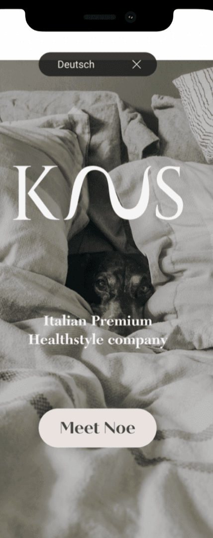
The brand posture was soft, editorial, and calming. I deliberately avoided the clinical greys and medical-blue palettes competitors leaned into, and built a warm neutral system instead — muted creams, soft sage, a single deep accent — paired with a serif/sans typography mix that felt closer to a wellness magazine than a mattress site. Imagery favored slow, lived-in moments over studio product shots.
The design system was scratch-built in Figma. With one designer and a four-week runway there wasn't time for a token-driven system, but I structured components for reuse from day one. In retrospect, I'd start with tokens even at this scale — engineer handoff would have been faster, and brand revisions later would have been a few overrides rather than a sweep.
Two interaction details I'm especially proud of:
- Spatial wizard transitions. The wizard didn't use stacked screens. Each step transitioned with a horizontal slide tied to a soft inertia curve — answering a question moved you forward in physical space; going back literally rewound the motion. The flow felt more like turning pages in a small book than tapping through a form. Testers repeatedly described the wizard as "gentle" or "calm" without being able to articulate why; the motion was doing that work.
- The "why this fits you" reveal. The recommendation screen animated in section by section — product first, then the three input-to-output mappings underneath. Pacing was deliberate: users read the rationale before the price. Purchase confidence was at its highest in the final round of testing.

Impact & Learnings
Because kNus launched at the end of the engagement, I don't have validated post-launch performance metrics to report. The honest impact picture is qualitative, drawn from the second round of moderated and unmoderated Maze testing and direct founder feedback.
- Users completed the shortened wizard at substantially higher rates than the longer first draft and reported feeling reassured rather than diagnosed.
- The "why this fits you" recommendation screen produced the strongest unprompted positive reactions across sessions.
- Trust-first PDP changes (reviews and return-policy above the fold) eliminated the back-and-forth scrolling pattern we'd observed in the first prototype.
- The founder reported that customer-support inquiries about sizing — Simon's biggest pre-launch worry — did not surface as a material issue at launch.
A future iteration with live traffic would be the right place to measure: wizard completion rate, PDP bounce rate, add-to-cart rate from wizard vs. catalog entry points, and mobile conversion.
What I'd do differently. I'd test the wizard with low-fidelity prototypes a full week earlier. We spent too long polishing feature sophistication before validating the emotional perception of the flow — onboarding fatigue showed up only when the wizard already looked close to final.
What went better than expected. Reassurance outperformed personalization. Users responded more to transparency ("here's why this is for you") than to depth of customization. That reframed how I think about recommender UX in adjacent categories: the explanation is often more valuable than the algorithm behind it.
The insight that killed a bad assumption. I'd assumed users wanted a detailed sleep quiz because more data should mean a better recommendation. Research showed the opposite — deeper questioning made the experience feel clinical, exhausting, and out of place in a wellness purchase. "I came here to buy something cozy, not diagnose myself." That single quote shaped the rest of the project, and the way I think about personalization more broadly.


“Kayla is very diligent and helped MyKnus to sharpen our brand voice, core brand identity, and primary audience.”