A donor's whole relationship, on one screen


The legacy problem
When I picked this up, donation management didn't really have a home. The features lived inside our legacy web-based service, right alongside every other account-management service — password resets, contact info, the works. Giving wasn't a place you went; it was a thing buried in a screen built for something else.
So donors leaned on people. They'd often need a member of our clients' service team to walk them through it, because the feature carried a long tail of known workarounds and inconsistencies. The team had answers — they just had to be on the phone to give them.
The reframe
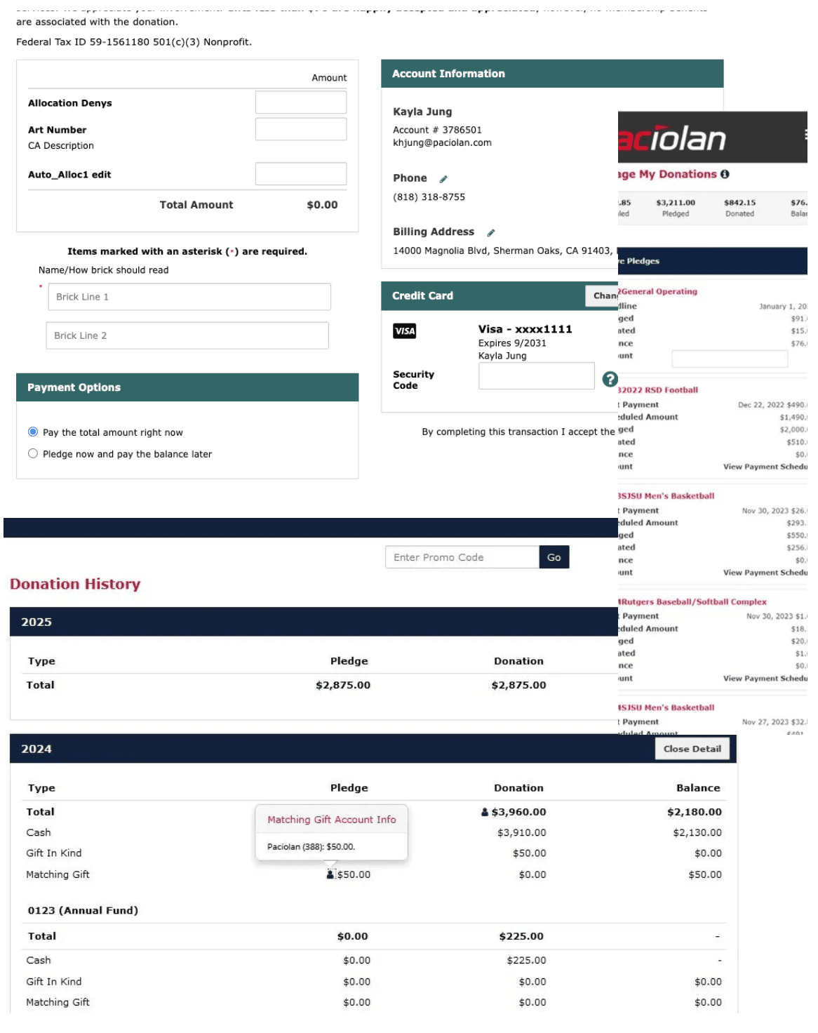
What if managing your giving was its own clear space — not a workaround inside a settings page?
The goal I set was straightforward to say and hard to do: improve the UX and the information architecture. Break it down into simple menus inside a unified space, so users could easily discover, review, and act on their active donations and pledges — or make a new donation as easily as possible.
That reframe is the whole project. Everything after it is just me trying to make those three verbs — discover, review, act — survive every screen size and every release.
How it evolved
This didn't arrive in one piece. It climbed there. We shipped an MVP to prove the unified space was even the right idea, then kept pulling the menus and the discoverability tighter with each version.
First pass at a single, dedicated space for giving — pulling donation management out of general account settings so there was finally one place to look. The goal here was just to prove the unified-space idea held up.

With the space established, I focused on the information architecture — simpler menus, clearer paths to review active donations and pledges, and a more obvious route to start a new donation.
Carrying the same structure down to mobile, where discoverability matters most. The menus had to stay simple in a much narrower space without losing the ability to discover, review, and act.
The mobile work was where the IA really got tested — if the structure couldn't hold in a pocket, it wasn't simple enough.


Taking it to clients
The reason any of this matters: our service aims to enhance the daily offerings of world-class universities and performing-arts venues for their students, donors, and audiences. So the real test wasn't an internal review — it was putting it in front of the people who'd live with it.
We showed the MVP, V1, and V2 to clients at PACNET — and they'd flown in from across the country to see it.
We showcased all three — Minimum Viable Product, Version 1, and Version 2 — at the annual PACNET conference held in Huntington Beach in February 2024. Clients traveled from various locations across the country to engage with our presentations, which meant the version ladder wasn't just an internal story. It was the pitch.

Where it's headed
The direction from here is the same one the whole project has been climbing toward: giving that's genuinely unified and genuinely discoverable. A space where donors can find their active donations and pledges, review them, act on them, and start something new — without needing someone on the phone to translate a workaround.
Each version got us closer to that. The next ones just keep simplifying the menus until the space feels obvious.