Building one from nothing, then working inside one someone else built
A system is a product
I've built a design system from nothing. I've also worked inside one that four hundred people had already been editing for fifteen years. Each one taught me something the other couldn't.
The thing they agree on: a design system is a product. The users are the people you sit next to. Which means the same rules apply. It has to solve a real problem, it has to be findable, and if people route around it, that's your fault and not theirs.
So I stopped measuring systems by how complete they look. I measure them by three things now.
Can a teammate ship without stopping to ask me a question. Does the library get detached or forked, and how often. And does what lives in Figma still match what lives in code six months later.
All three are about what happens when you're not in the room.
Building one: Pac X
Paciolan makes live-event software. Enterprise tools for the people running the event, consumer tools for the people attending it. Each side lived in its own design file, with its own version of a button.
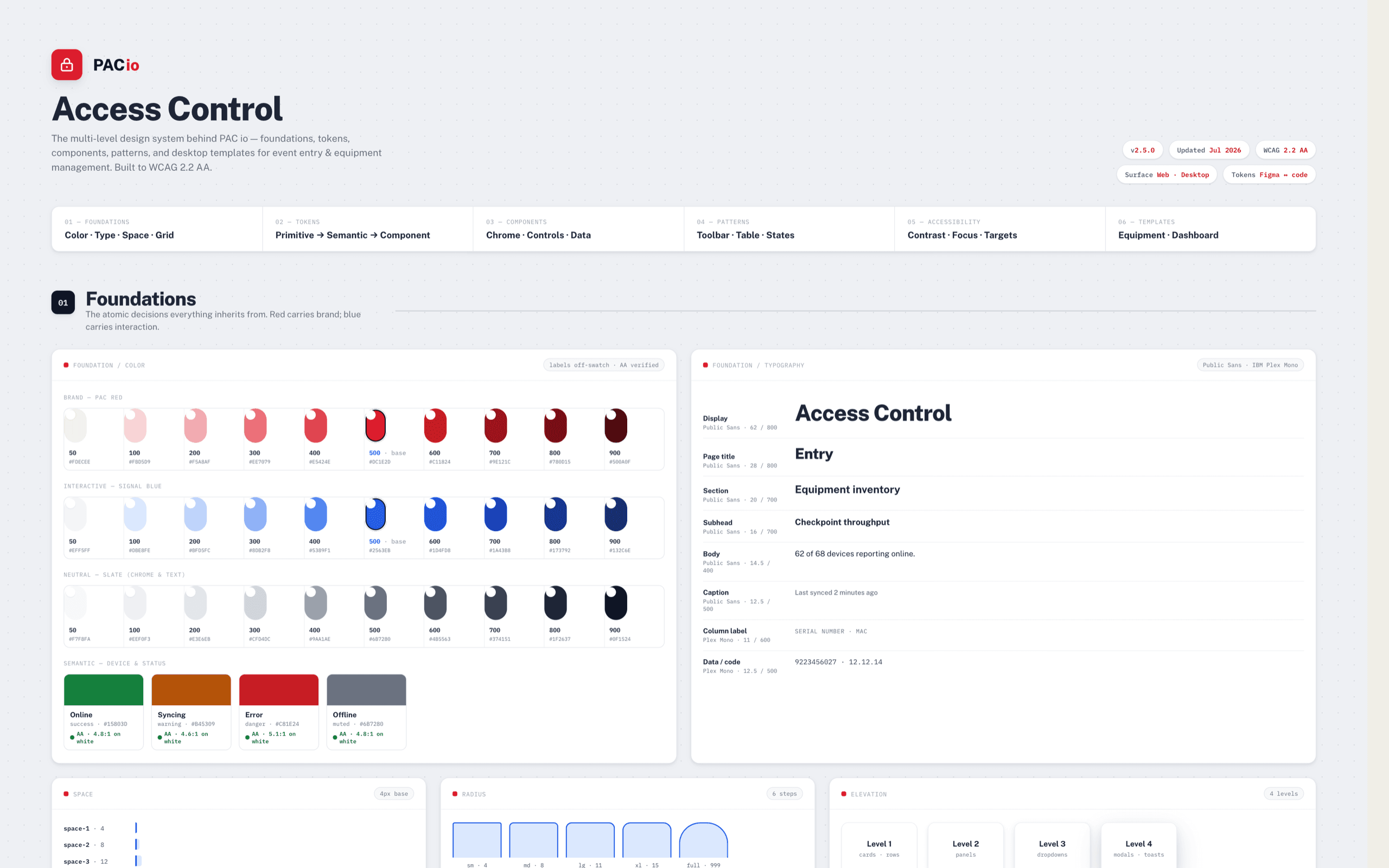
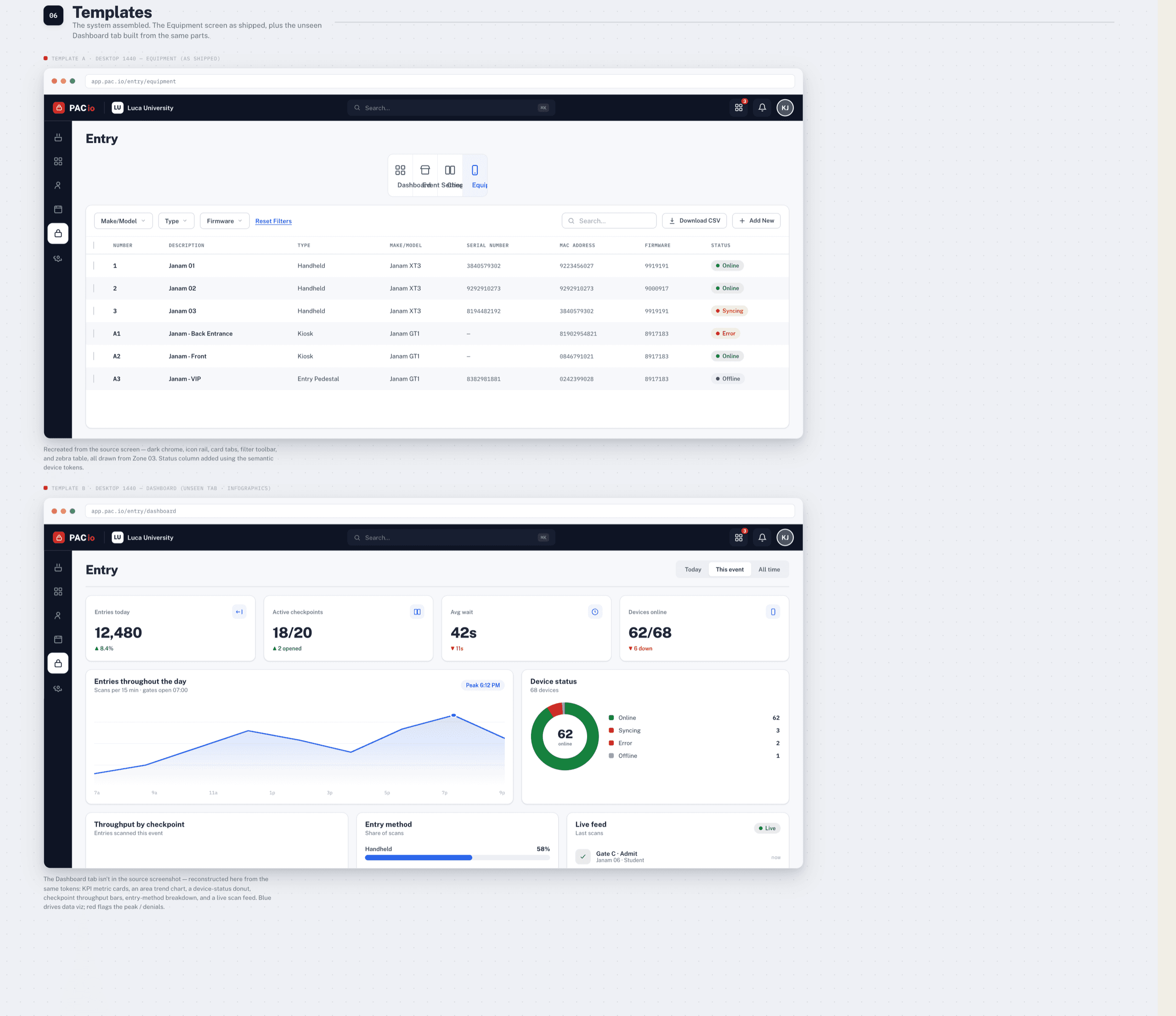
Pac X grew into the system behind pac.io: foundations, tokens, components, patterns, accessibility, and desktop templates. It's at v2.5 and built to WCAG 2.2 AA. I became one of the main contributors, and I led design on the first feature built with it.
That order matters. The component library didn't exist first and get adopted later. It came to life at the same time as the product it served.
The product was Access Control 2.0, a brand-new enterprise tool replacing software written in the 1990s. Our clients had built entire jobs around the old thing. So every component had to earn its place against a workflow someone had performed ten thousand times.
One source of truth, in three tiers
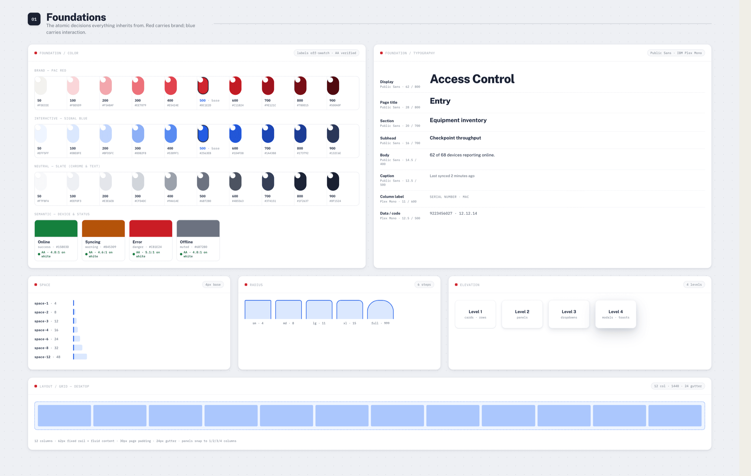
Tokens go primitive → semantic → component. red.500 becomes color.brand.default, which becomes button.primary.bg. The tokens sync between Figma and code, so the name a designer says out loud is the name an engineer builds with.
That's the whole point of the middle tier. Nobody argues about whether a button should be #DC1E2D. They argue about whether it's a brand action or a destructive one. That argument has an answer.
Naming was the other half. We structured names as [category/use/variation], like trend_Card/trend_direction/upwards, so a name carries meaning instead of carrying whatever the person who made it was thinking that afternoon.
Every block with its real states
The part people skip is states. It's easy to document the happy path and leave hover, focus, error, and empty for whoever gets there first. Then four designers invent four error styles and the system quietly stops being one.
So each block ships with the states drawn.

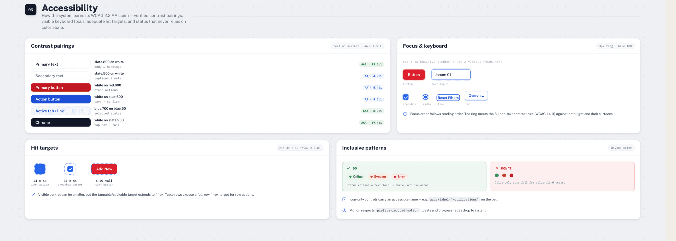
The accessibility claim was the same idea. A system that says "WCAG 2.2 AA" and leaves you to trust it isn't making a claim, it's making a wish. Ours had to be checkable.
Every contrast pair ships with its verified ratio. Focus rings meet the 3:1 non-text rule against both the light workspace and the dark chrome. Hit targets clear 44px even when the visible control is smaller. And status is never carried by color alone. Every state has a label and a shape behind it.
Underneath it all: templates. Equipment and Dashboard, assembled entirely from the layers above, so a new screen starts as an arrangement instead of an invention.
Working inside one: AOL
The other half of what I know came from the opposite position. At AOL I led design for the community and monetization squads, and supported the system team as they rebuilt a fifteen-year-old ecosystem around us.
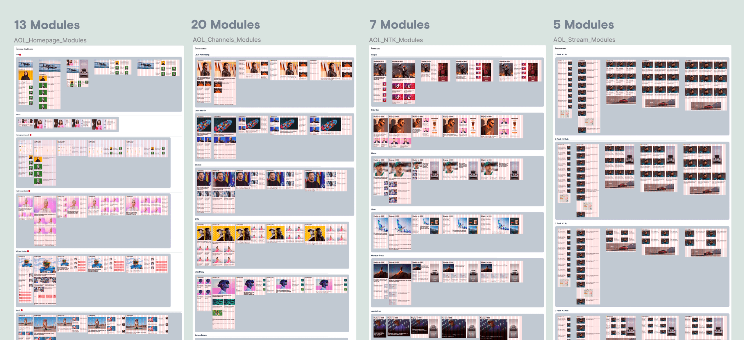
I couldn't set the rules there. I could only find out what the rules currently were, which turned out to be a real question. Components were scattered across files, names didn't agree, and the Figma library no longer matched what engineers had in Storybook. Two versions of the truth, drifting a little further apart every sprint.
So I spent a lot of time in the audit. This is what an honest inventory looks like before anyone gets to talk about a vision.
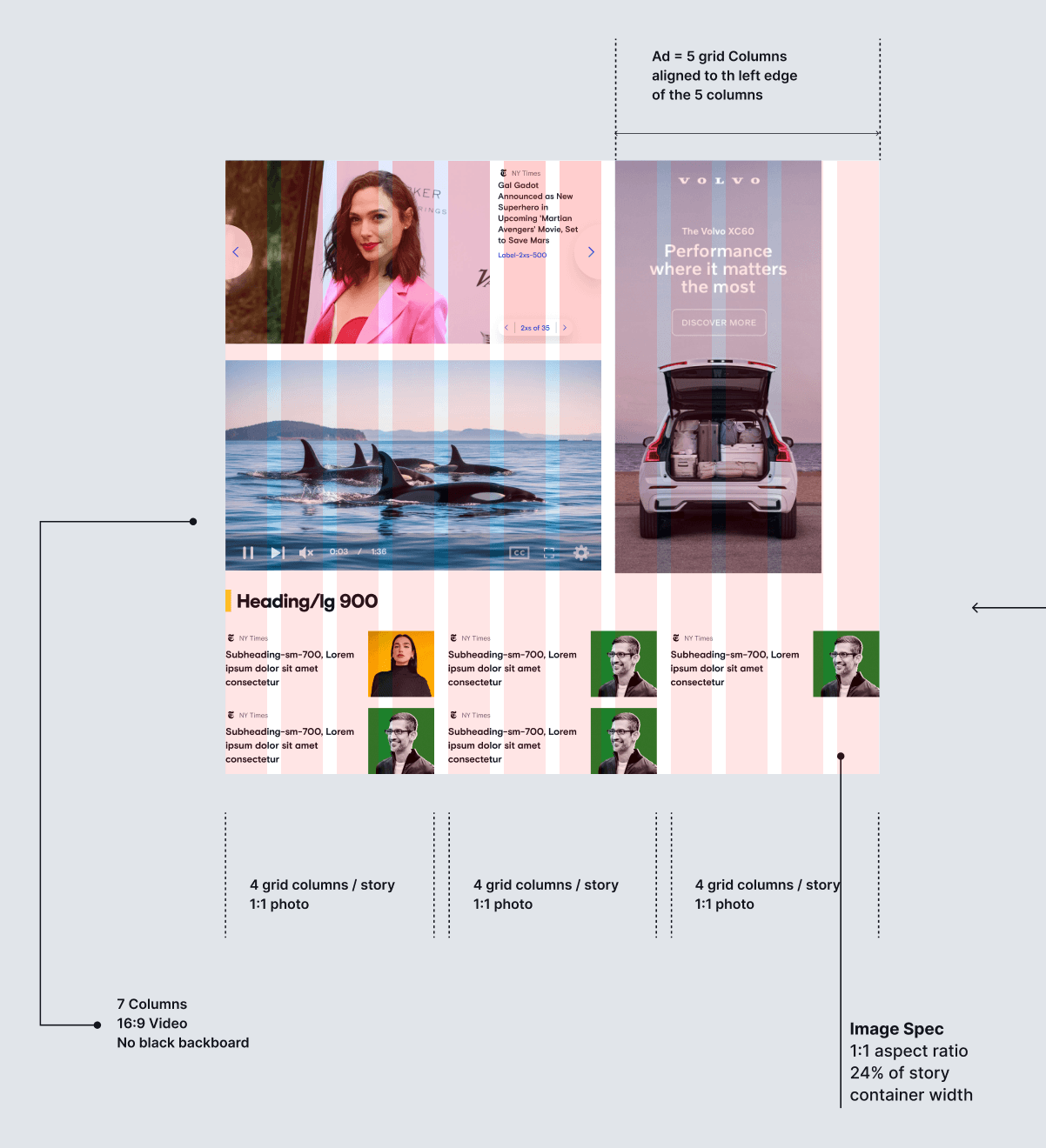
I led design for the community and monetization squads alongside two PMs, three engineers, and four other lead designers. My focus was keeping the look and feel consistent across my surfaces while both contributing to and consuming the shared system. The hard part was never the components. It was the alignment: making a call that was right for community and still right for everyone else pulling from the same library.
The one constraint every squad was working against: a legacy codebase.
I couldn't design as if we were starting from scratch. We weren't. Every decision had to balance the ideal direction against what was actually shippable on top of fifteen years of accumulated code.
So I treated "shippable" as a design input, not a compromise made after the fact. When I proposed a cleaner alternative, I proposed it next to what it would ask of engineering. That made it far easier for the other leads and the devs to say yes.
The effort ran on two tracks at once. Neither could wait for the other.
Cleanup
Merge redundant components, agree on naming, and close the gap between Figma and Storybook, so the thing you look up is the thing that ships.
What's next
A forward direction for branding and layout. A foundation that could grow without drifting back into the same fragmentation.
Cleanup keeps the present honest. The forward track keeps you from rebuilding a system that's dated the day it's done.
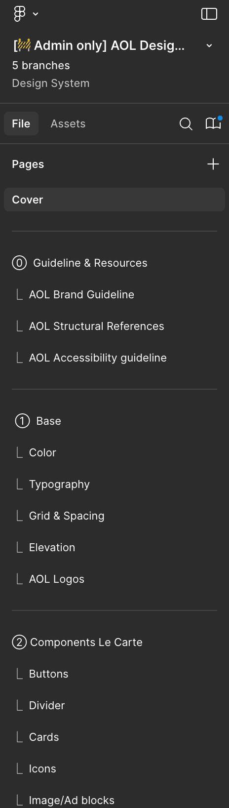
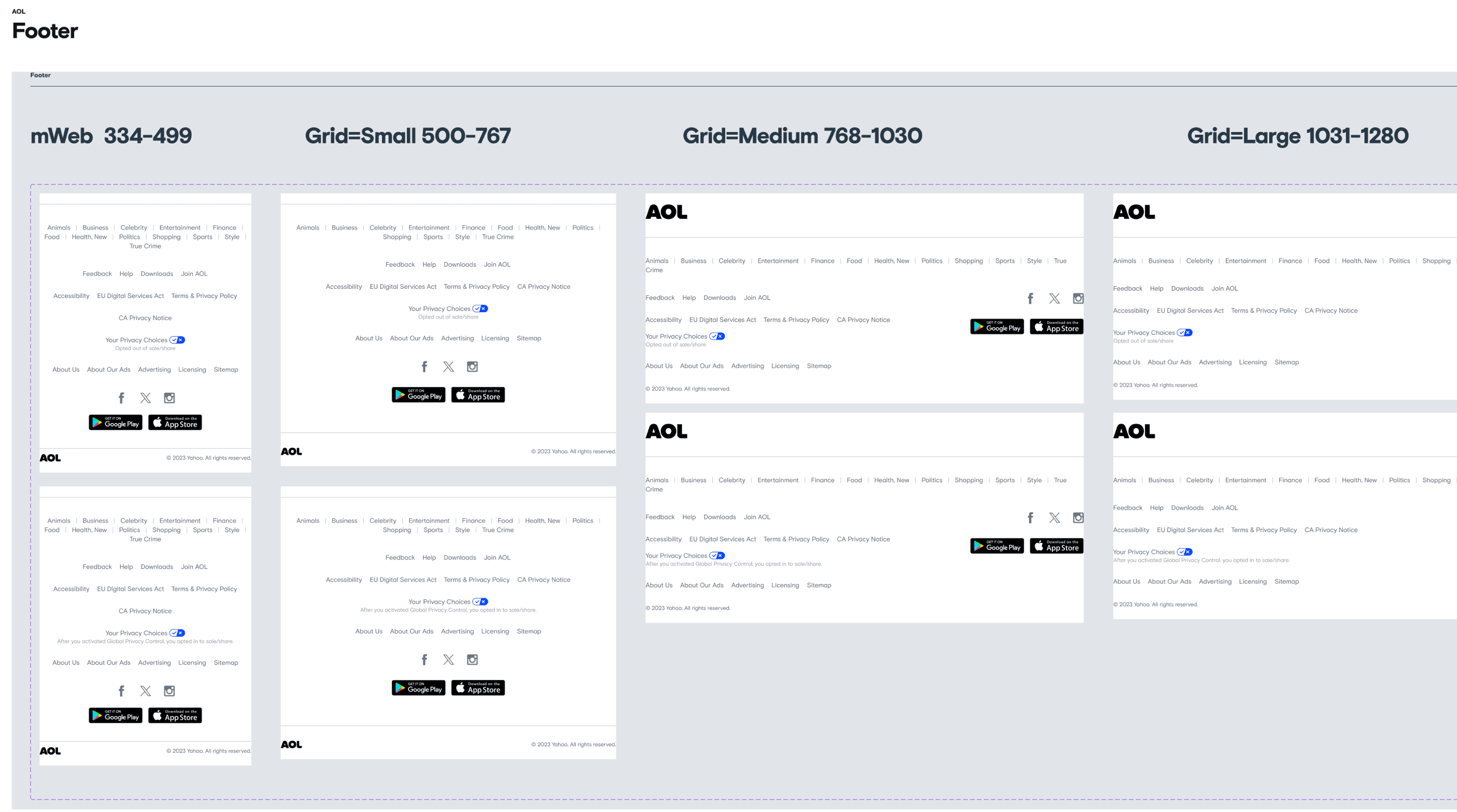
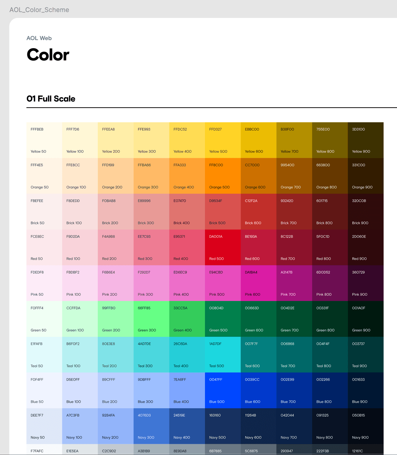
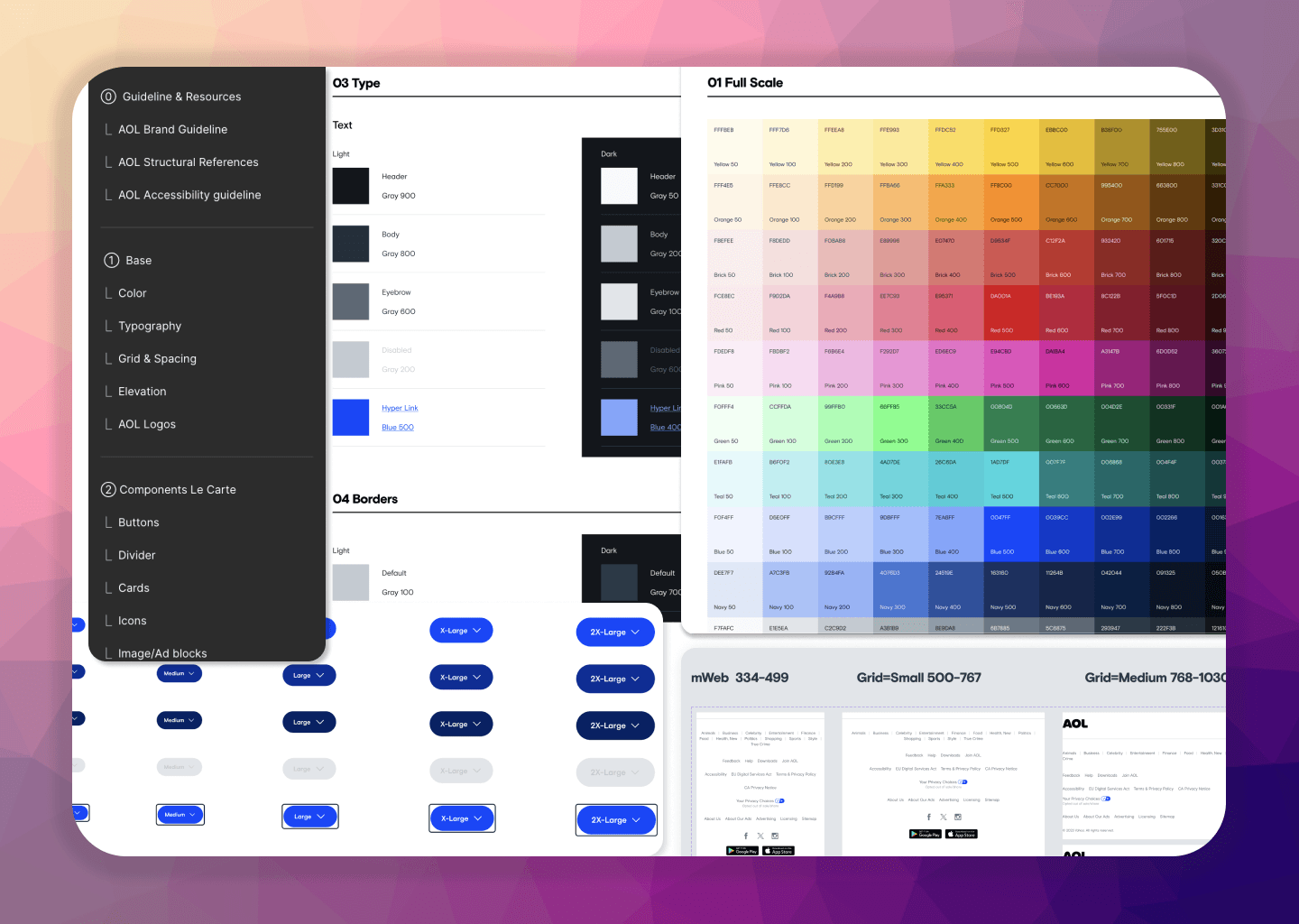
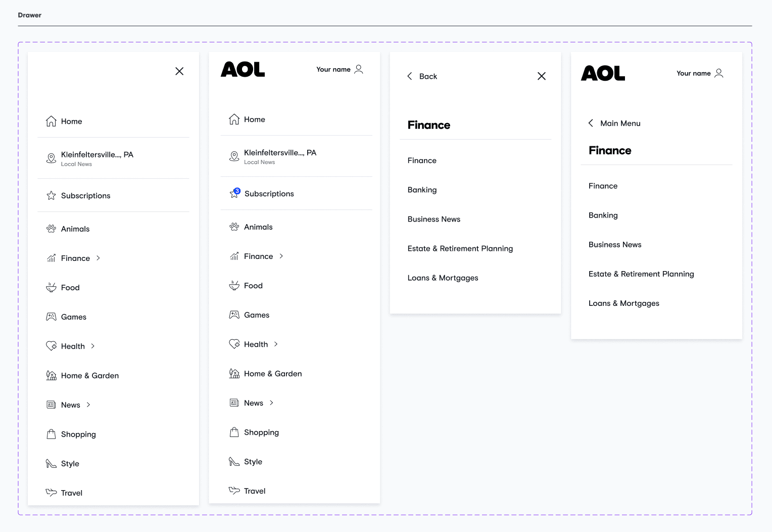
Seventy percent of squads moved onto the refreshed system, and onboarding got noticeably lighter. The last thirty percent were squads with their own deadlines, which taught me its own lesson.
What belongs here is the part that changed how I build. Inside someone else's system, I learned that the hardest problem isn't the components. It's that a source of truth only helps if people can find the truth, and trust that what they found is current.
What each one taught me
Building Pac X taught me what a system costs to make. Working in the AOL system taught me what it costs to live with. The three things I'm rebuilding my habits around now each come from a specific bruise.
- Slots. Flexible regions inside instances, so people can customize without detaching. Detached cards and modals were half of what I found in the AOL audit. Every detachment is a small vote against the system, and most of them were people who just needed one region to be different.
- Variables and modes. One component set that themes across brands and surfaces. If we'd had this at Paciolan, our two separate design files, enterprise and consumer, each with its own everything, might have been one.
- Code Connect. Design components mapped to real code, visible in Dev Mode. It addresses the exact Figma-to-Storybook drift we fought at AOL, where the gap between the two was nobody's job and therefore everybody's problem.
And the one I'd do differently if I started Pac X again tomorrow: tokenize before you inventory. We catalogued components first and derived tokens after. Starting from a semantic token layer would have made the audit faster and every deprecation safer.
“Kayla truly excels at cross-functional leadership, acting as a vital bridge between design, engineering, and product squads to ensure seamless alignment.”